When I was looking at options for a cover design for my latest book ‘Murder, now and then’ a friend suggested I set the task as a challenge for design students at his college. The tutors are always on the look out for ‘real business opportunities’ to give their students experience of following specifications, meeting deadlines and working with the business world.
I was delighted to think that my new book cover would be designed by local students and, as a college tutor in a previous life, I looked forward to working with them both actually and virtually. There was also a certain amount of nervousness about the outcome too.
After an eventful but enjoyable time the proposed covers were submitted for a competition. The outcome of this was that I chose the two covers which won the most votes, one to be used for the paperback and the other for the ebook.
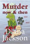
~ Murder, now and then available on Amazon
This is the overall winner and paperback cover. It is intriguing, combining:
~ the elements of time – the poppies and dagger-like objects – WW1
~ the circuit board at the top – the future – 2019
~ farming – with the fields
~ the missing piece of the puzzle over Bedfordshire
~ the grave of the girl murdered in 1919
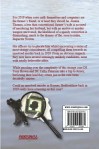
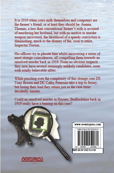
~ and on the back a Sherlock Holmes spyglass
~ over the island of Jersey
~ and the cameo of the missing girl from 1919 !!!!
Would readers grasp even half of the symbolism embedded in this cover? Did it matter? Would readers think about it afterwards? Yet again did it matter?
Strangely, this cover was particularly liked by female potential readers.
Does it have effective impact as a design? These were all questions I set aside as I prepared for the launch.
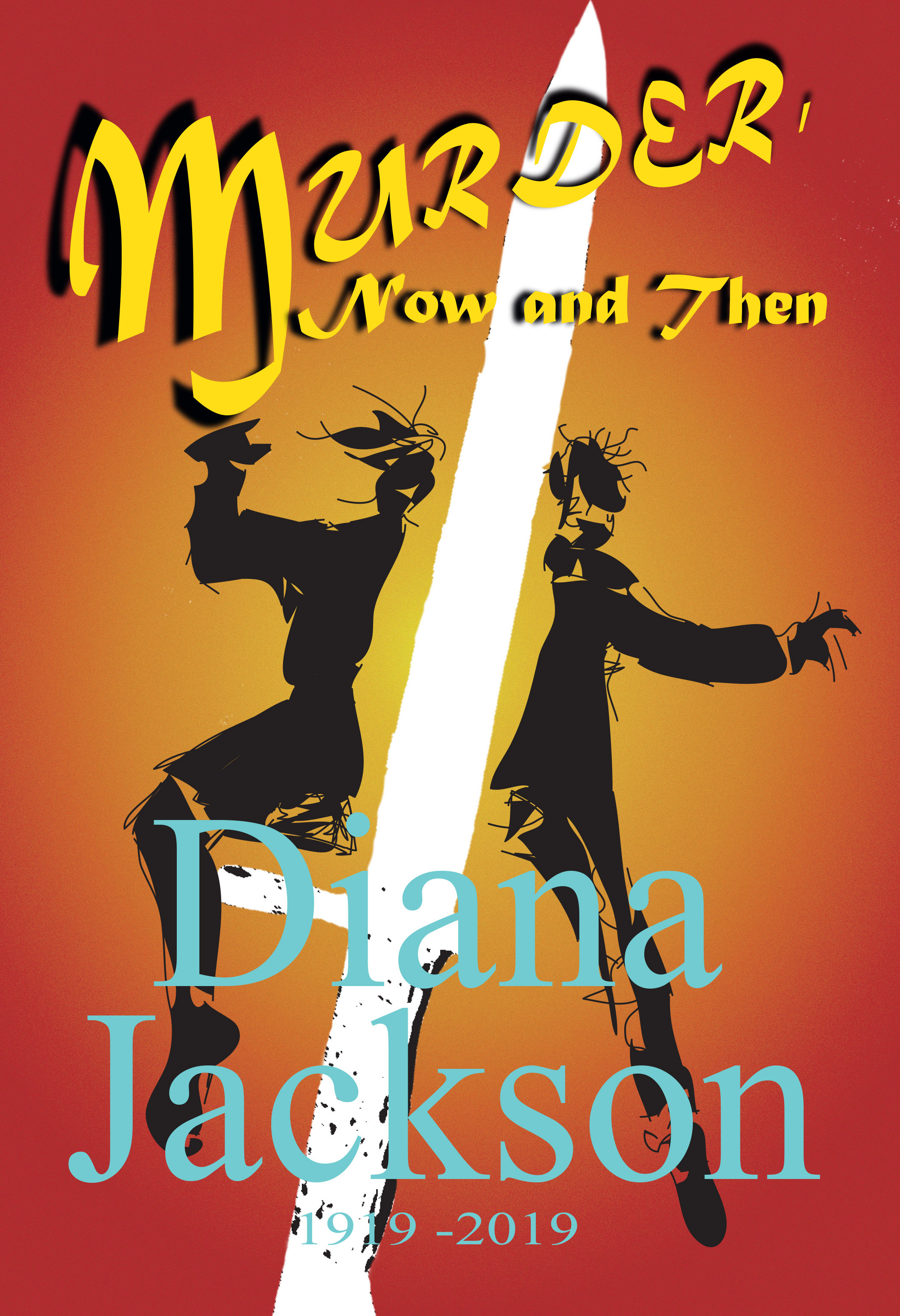
The e book, which was preferred by the men who voted, was quite different.
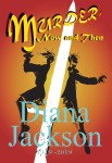
Available on Kindle
~ it had an impact with the colours red and yellow
~ the dagger-like weapon slashed through the centre
~ the figures spoke of scarecrows or of country dancing – a link to country roots
~ it had a retro feel with the lettering, speaking of days gone by – the dual time zones of 1919 and 2019
Using two covers has been great, but they have also caused a few problems. One of them being the title. In my specification I suggested that the ‘now and then’ should almost be an aside and did not have to be in capitals. That was fine but one chose to use them and the other didn’t. My dilemma now is how do I write about the novel – with capitals or not? Often I have used a comma and not used capitals, but sometimes I felt it appropriate to be more conventional.
My question to you is ‘does it matter’ as long as I am consistent? What do you think?
 Here’s the line up for the action packed Indie Literacy Festival on 23rd July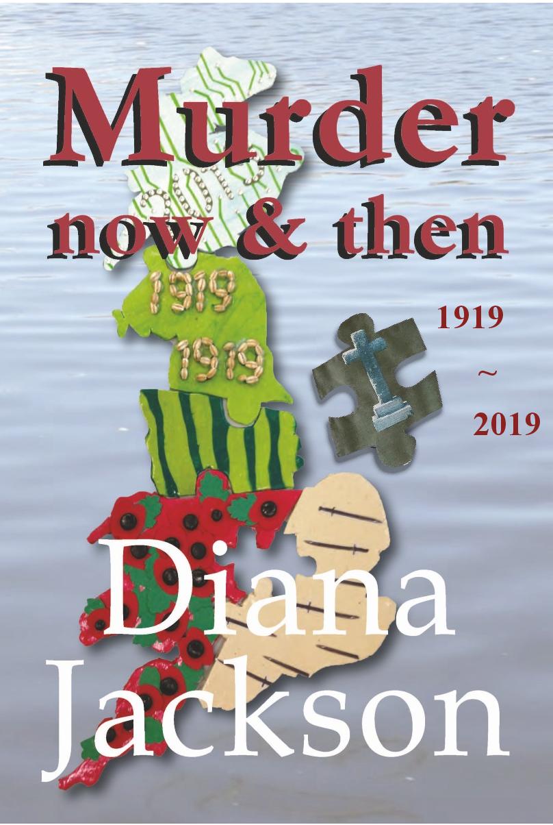


 Diana Jackson